# 2 in my big robot series! I find it hard to maintain interest in doing a series idea in my free time, but it's working out so far. I'm also happy to say that working with a Cintiq is getting more and more comfortable. Look for #3 in the next couple months.
Sunday, April 27, 2014
Big Robot City Valley Super Awesome Go!
# 2 in my big robot series! I find it hard to maintain interest in doing a series idea in my free time, but it's working out so far. I'm also happy to say that working with a Cintiq is getting more and more comfortable. Look for #3 in the next couple months.
Saturday, April 26, 2014
A touch of toy design continued...
I helped develop two other ideas in the vein of the Zooble toy line - Monster Masherz and Teensie Titans.
Monster Masherz took the animal transformation of the Zoobles' characters and added an attitude change. Then we took it one step further to apply to the vehicles as well. When the animal drivers transform from cute to brute, the trucks transform into ferocious animal/machine hybrids. When you press/release on the character's head, the face transforms and likewise when you press down on the vehicle. Unfortunately, we only got to develop two of these ideas.
Mad Dog
Guerillavenger
Teensie Titans took a medieval fantasy route. Warriors throughout history battling it out on animals that transform into mythological beasts.
Lion transforms into Griffin.
Bull transforms into Minotaur.
Minotaur reverts back into bull.
Rhino becomes Minotaur.
Snake becomes Dragon.
A touch of toy design.
While my assignments usually entail visual development for game trailers or something regarding animation, occasionally something else comes my way, in this case, 3 toy line ideas that would be a continuation of the toy designs used for Spinmaster's Zoobles.
Zooble
The Zoobles were doing very well, but were geared towards young girls and the goal of these pitches was to present ideas that would be geared towards young boys.
The first pitch was the "Meekos Miners," based on the idea of underground miners who use fun, vehicles to mine for valuable minerals and ore.
Also activated by the movement of the wheels/treads, a pincermobile and a steamroller pincermobile.
A drilling tank where pushing it along the ground would cause the drill to rotate or move in and out of it's tube.
A loading transport vehicle for carrying ore.
A combination vehicle. Three separate vehicles would come together to form a conveyor belt machine for collecting rocks and breaking them open to reveal the valuable ore inside.
Molecule interior.
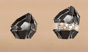
Eventually, the idea evolved from just some kind of crystalline or molecular structure to something more fantastical and organic - the FLOWERZARD - rock encrusted boulders that break open to reveal strange plant life within.
We only had a few days to design our ideas and put a pitch together, but I think we came up with a lot of cool stuff and I hope more toy designs come my way in the future.
Friday, April 25, 2014
Max Steel Wallpapers! Before and After….
A lot of the Max Steel work that comes my way requires a significant amount of paint over to get it to the level or beyond of the show. I've included the before and afters of a couple illustrations that I did.
Max Steel vs Extroyer
After some photoshop lovin'.
Just the 3D renders.
Gangsta Pose
Putting the 'tude in attitude.
Just the 3D renders.
My preliminary sketch.
Max Steel vs Ultimate Elementor - SHOWDOWN!
I developed a bunch of sketches for a promotional poster depicting Max Steel fighting Ultimate Elementor. While they ended up picking another artist's sketch, I'm still pretty happy with the way these came out. The greatest challenge was trying to depict Ultimate Elementor, who is several stories high, but keep Max from looking puny. There were the usual requirements of being super dynamic and forcing perspective.
Sooo ninja!
I forgot that there was no cropping. Still a cool composition.
Sigh. Max can't be running away or falling back.
This tricky thing with Ultimate Elementor is that all of his arms need to be doing something. They each represent a different elemental power, but even so, they can't all be throwing/slashing/shooting.
I started doing these sketches in earthy reds and burnt sienna after working on a similar project with the fantastic story illustrator, Brocasso. Check out his work: http://www.brocasso.com
I'd seen him sketching up in these colors and when I asked him why not black or blue, he mentioned that sometimes that can look a little stark, but a warmer sketch color can look a little more appealing and a little more like a traditional media. I found that a looser painting looks less smeary and more "painterly" when given this treatment. It was really ideal for a project which required a really fast turnaround. I think I only had a day or two to develop these.
Max Steel package pose!
I used to collect the backboards to my action figure packages as a kid because the art was so kickass, so it was quite a treat to get a chance to design the pose for the Max Steel action figure packages.
The third pose made the cut, and while the assignment was fairly cut and dry, it was much more challenging to create a good poses that fit than I would have though. You need something dynamic, that faces inwards (bringing your eye back into the center of the package), that fits between the logo and the corner, where Steel can fit separately and mimic Max's pose. Oh yeah, and don't cover up Max's face or chest, the two places where the "M" symbol appears and where it always seems Steel seems to fit compositionally.I cleaned up the sketch, the talented animator Joel Fletcher posed the 3D model to match, and then the boys and girls at Mattel did a final paint over of the image to punch up the contrast and glowy parts. And that's the way the cookie crumbles.
Max Steel inspirational posters.
Back before Max Steel settled on the show that debuted last year, I was tasked to develop a series of inspirational poster thumbnails showing Max Steel in a much more epic, more contemporary light. We depicted him as if he would be the next toy franchise to make the jump to the big screen and covered as many genre categories as possible.
After developing several thumbnails, I painted several of them to the next level of finish.
Definitely influenced by the Dark Knight poster.I learned an interesting thing about superhero brands when working on this project. At one point, the above motorcycle poster was vetoed because "Max Steel never runs away." It may depict the thrill of the chase, but if the hero is running away, it either makes him look incapable of facing the odds, or it makes him look guilty, whether wrongly accused or not.
I also found that whenever you put a map of the world in there, it always gives it a globetrotting feel. If you make it look computer generated, suddenly you enter into spy/global intrigue territory.
If you don't know much about the character or the story, don't add anything else and work with composition, showing less and creating intrigue.
I had to abandon my tribute to Akira thumbnail but there's a little bit of that and Tron Legacy in here. Little did I know that when the show would come out, Max's Turbo cycle would "turbofy" and emit an energy trail from the wheel.
Max Steel artwork dump!
I recently got permission to show off much of the work I've done for Mattel's Max Steel brand that came out last year. Not familiar?
Check out the trailer: https://www.youtube.com/watch?v=IS9DzwAE5Ao
One of the hardest and longest projects I've worked on was a promotional poster I created for season 1.
Then I went to town painting in the turbo energy effects, adding glows, placing episode images into the hexagons, and painting over the Max Steel model to punch up the values and colors and make it look like he's exploding with energy. After about 2 months of iterations we came to this final image. On the last day, a few hours before the deadline, Mattel asked us to put the helmet on, and voila, done! It's fascinating to be part of a such a big project with so much research and design put into it. So much time and effort was put into deciding which images went into which hexagons. Is the pose too aggressive? too passive? Is it symmetrical but also dynamic? At the time, it was also a big question as to whether or not to show Max with his helmet on or off. Since then, for any project I work on, I always try to remember to render a version with the helmet on and with it off. It's become a guiding principle that when Steel is attached to the suit, he's in superhero mode with the helmet on, but when Steel is floating separately next to him, the helmet is off and he's not in facing danger.
I never know exactly what the end use of any of my projects will be. We created this poster at 27" x 40" and painted to hold up at that size for print. Ironically, I've only seen it used for Amazon and Netflix, and since they have set thumbnail sizes it always gets cropped to half it's size. Still, it's awesome.
Monday, April 7, 2014
El Matador
It's been too long since I've been out landscape painting and after a month of trying to coordinate with friends, I succeeded in luring my friend Nick Schumaker (http://nicholasschumaker.blogspot.com) out to El Matador. I have to admit that the weather only seemed ideal. Bright and beautiful, but windy and sandy. You can see the grains of sand that got into the paint when you click on it. I had to empty sand out of my wallet later too. I ended up having to work really quickly as my paint was drying on my brush and my palette kept drying out as well. To top it off, there must have been a record number of model shoots and selfi shoots that day passing through with camera crews and onlookers. There was even a guy with a metal detector. It's not just in the movies folks. But as you can see, the magic lives on. I'm pretty happy with this painting and after having been to El Matador so many times, what were the odds of finding a new and unique place to paint? Here's a recap of some of the El Matador paintings I've done over the years:


