Friday, May 24, 2013

Future Monopoly Houses.


 One rule that ran through all the Monopoly pitches I've worked on was that all of the building designs had to decrease in oppulence and size as you make your way around the board away from the Boardwalk. In addition, the designs had to work with the game mechanic of filling a property with houses until the player upgrades to a hotel. Each rectangular property was split into 4 even pieces and each building had to fit in one of the quarters. Other than just vertical scale, the number of levels to the house as well as the inclusion of porches and patios were used to show wealth. One of the ideas put forth early in conception was the idea that plant life was a precious commodity in the future and so only the richest people have yards and foliage on their property. To fit with our modular design style, we designed all our buildings as fully self-contained terrariums.  To create a little variety over the course of eight designs, I ended up putting little gardens and grottos on different floors to vary up the design.

Wednesday, May 22, 2013

Future Monopoly


Boardwalk

 Corner to Corner - "Free Parking" to "Go to Jail"

Houses and Hotels

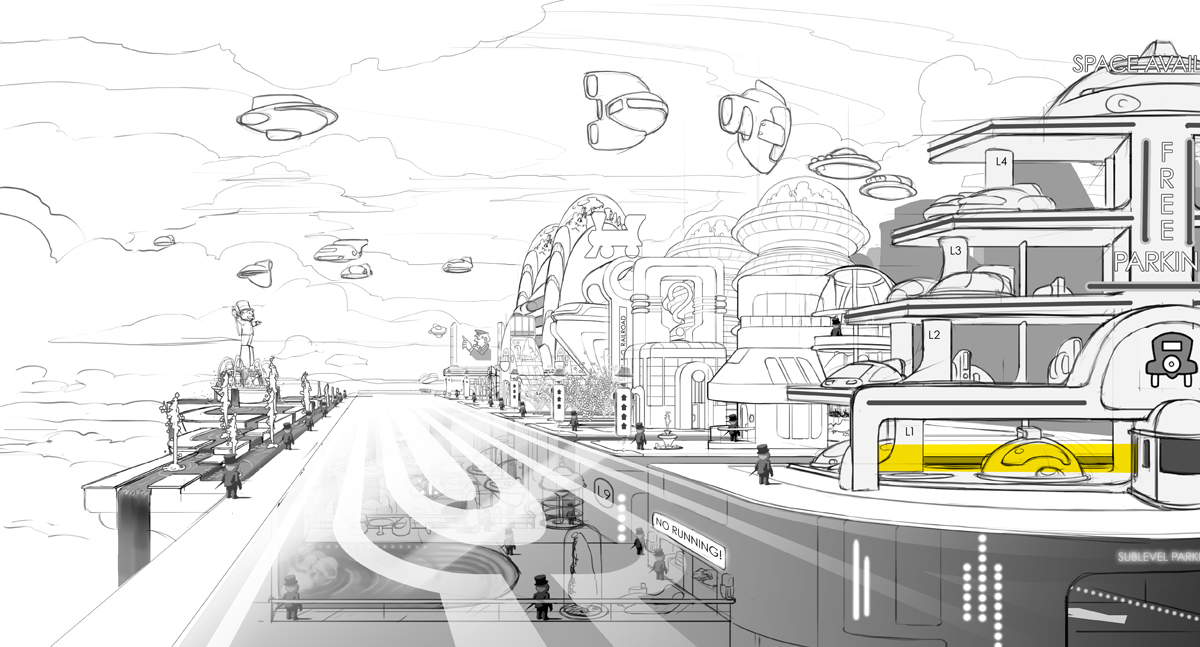
A few years back, I got the chance to work on a couple of themed Monopoly projects for EA - a futuristic monopoly, a world cities monopoly, and a Nintendo monopoly. The schedule was very intense, but luckily, I did not have to split my time with any other projects, a rarity at BrainZoo. The client wanted a futuristic take on Monopoly City referencing retro and art deco scifi styles to create a very fun and family oriented atmosphere. This was awesome and had plenty of source material, but extremely difficult as well in that several fantasy films had recently come out utilizing that same style. Finding our own niche without looking like "Meet the Robinsons" or "Robots" was not easy. In the end we settled on a Cloud City/5th element approach. Since the game was not designed to have an open world exploration approach, but rather a turn based progression from street level, from property to property just like the board game, we looked for ways to make the world feel bigger. By placing the world in the sky, we could show other possible game levels in the distance and thus, part of a much more expansive world. By making the streets see through, we could show that Monopoly City itself was merely the top of some unknown quantity of levels. A theme that came up a lot as we designed was the idea that Monopoloy City continuously expanded, unfolded, and evolved. A lot of the  building structures are very modular for that very reason. Small things coming together to make large things. More to come soon!

Sunday, May 5, 2013

Needs lens flare!

It's been a while since I finished this piece, but I always thought it was missing something. I don't usually put in lens flares to my artwork, but after looking at some the awesome work done for Halo 4 and Dead Space 3, I had to put one in.

Sunday, March 31, 2013

New blog banner!

I think it's been about a year and it's time for a new blog header. I'm trying to keep things graphic, but also make things a little more painterly.

Friday, February 22, 2013

Pepe and Lucas Production Stills.


Some production stills from BrainZoo Studio's short film "Pepe & Lucas," as promised.

Tuesday, February 5, 2013

"Pepe & Lucas" on Kickstarter!


We haven't been idle at BrainZoo Studios. After completing our in-house short film "Pepe and Lucas," we've been busy setting up a Kickstarter campaign, so we can continue to explore the rich world of "Pepe & Lucas" through additional episodes, toys, comics, and more. Click below to help back this project and also see some concept art from yours truly!

Kickstarter link:
http://www.kickstarter.com/projects/296479411/pepe-and-lucas-the-animated-series 

"Pepe & Lucas" trailer:
http://www.brainzoostudios.com/
http://vimeo.com/53193378

Sunday, January 27, 2013

Hellboy Final color.


Perhaps I should have mentioned this in my previous post, but it took a while to get the lighting situation that I felt worked. Since the setting is Easter Island, I started with a more cheery look with more daylight lighting and punchier colors. That just didn't look quite right. However, I didn't want to go with super gloomy or foggy colors, so I started hitting sunset colors. That still didn't quite feel right. The breakthrough came when I painted the background sky with that super cyan blue at the bottom. It totally gives the scene a slightly supernatural vibe. With that in place, I could still keep the punchier colors in the foreground and really pop Abe and Hellboy. The rest was just brushwork and adding texture. This piece came together very quickly.