Thursday, May 8, 2014

Marvel's Iron Man and Hulk - Heroes United


I had the tremendous pleasure of working on a Marvel project recently at Brain Zoo. With the success of the Avengers and Iron Man franchises, we were hired to animate a dvd feature film starring Iron Man and The Incredible Hulk. My main responsibilities on this project included creating lighting studies to help establish the mood as well create several matte paintings for production.

Before beginning production, we did a test sequence, which can be found in the movie in various parts, of Iron Man fighting Zaxx at night. With limited time and budget and an emphasis on glowing effects, we took a very graphic approach. To help pop the effects, the movie takes place entirely at night except for the final scenes. We used primary colors a lot for the outdoor scenes -  an epic red dusk leading to a night sky to pop out a red and yellow Iron Man and a green Hulk. I didn't end up handling the lighting studies for the interior, but they're often dark rooms illuminated by the main superheroe's complimentary colors, red light and green light.  


Some of the above keys are a little bit styled. At the time, we considered having more 2D comic effects,  like speed lines for flight scenes and energy trails for Iron Man's boot/hand repulsers. We ended up abandoning those ideas, but the show ended up getting a nice 2D look, and no wonder, our creative director Leo worked on Tron Uprising!


When I'm tasked with developing color keys for a movie, a lot of times I'll go through the animatic and choose frames from key moments in the story or action that can guide the lighters through the rest of the shots and do really rough color keys. If time permits, I'll bring them to the level of the above keys or higher. This is helpful for the Brain Zoo team, but especially for discussing lighting ideas with clients.

Below are the matte paintings I created for production.
 A gamma explosion goes off outside city limits.

We were able to use one global sky matte for most of the film, but there were a few shots that required their own unique painting.  I painted in the shield helicarrier for guidance.

 Hulk and Iron Man fall from the Shield helicarrier to a graveyard just outside of town. There was only a center of town model that was an enclosed environment, so for all the wide above shots showing a whole town, I had to paint the town form scratch.

 Amazing, for one or two seconds, Hulk jumps up to the helcarrier from left to right, which of course requires a new matte painting since we have no real 3D town.

 Iron Man being chased by missiles flies by came in a wide arc and back again.

 The movie ends on a new dawn over the town. You can see a frame from the movie below. A lot of times my matte paintings sit way in the background and there's so many effects or such camera movement, you can't really pick any of the details out, but you get a nice uninterrupted shot here. I even separated the clouds out so they could be animated.


Sunday, April 27, 2014

Big Robot City Valley Super Awesome Go!


# 2 in my big robot series! I find it hard to maintain interest in doing a series idea in my free time, but it's working out so far. I'm also happy to say that working with a Cintiq is getting more and more comfortable. Look for #3 in the next couple months.

Saturday, April 26, 2014

A touch of toy design continued...

I helped develop two other ideas in the vein of the Zooble toy line - Monster Masherz and Teensie Titans.

Monster Masherz took the animal transformation of the Zoobles' characters and added an attitude change. Then we took it one step further to apply to the vehicles as well. When the animal drivers transform from cute to brute, the trucks transform into ferocious animal/machine hybrids. When you press/release on the character's head, the face transforms and likewise when you press down on the vehicle. Unfortunately, we only got to develop two of these ideas.
 Mad Dog

Guerillavenger

Teensie Titans took a medieval fantasy route. Warriors throughout history battling it out on animals that transform into mythological beasts. 


 Lion transforms into Griffin.

 Bull transforms into Minotaur.

 Minotaur reverts back into bull.

 Rhino becomes Minotaur.

Snake becomes Dragon.

A touch of toy design.


While my assignments usually entail visual development for game trailers or something regarding animation, occasionally something else comes my way, in this case, 3 toy line ideas that would be a continuation of the toy designs used for Spinmaster's Zoobles. 

Zooble


The Zoobles were doing very well, but were geared towards young girls and the goal of these pitches was to present ideas that would be geared towards young boys.

The first pitch was the "Meekos Miners," based on the idea of underground miners who use fun, vehicles to mine for valuable minerals and ore.

 The Zooble brand line's hook is that the faces transform to reveal an a cute face underneath - panels over the eyes often flip outwards to form ears revealing different colored eyes beneath.  We experimented with simple transformations of the vehicles the Meekos would operate.
 Also activated by the movement of the wheels/treads, a pincermobile and a steamroller pincermobile.
 A drilling tank where pushing it along the ground would cause the drill to rotate or move in and out of it's tube.
 A loading transport vehicle for carrying ore.


A combination vehicle. Three separate vehicles would come together to form a conveyor belt machine for collecting rocks and breaking them open to reveal the valuable ore inside.

 Magical crystal interior.
 Molecule interior.

Eventually, the idea evolved from just some kind of crystalline or molecular structure to something more fantastical and organic - the FLOWERZARD - rock encrusted boulders that break open to reveal strange plant life within.

We only had a few days to design our ideas and put a pitch together, but I think we came up with a lot of cool stuff and I hope more toy designs come my way in the future.

Friday, April 25, 2014

Max Steel Wallpapers! Before and After….

A lot of the Max Steel work that comes my way requires a significant amount of paint over to get it to the level or beyond of the show. I've included the before and afters of a couple illustrations that I did.

Max Steel vs Extroyer

 After some photoshop lovin'.

Just the 3D renders.

Gangsta Pose

Putting the 'tude in attitude. 

Just the 3D renders.

My preliminary sketch.

Max Steel vs Ultimate Elementor - SHOWDOWN!

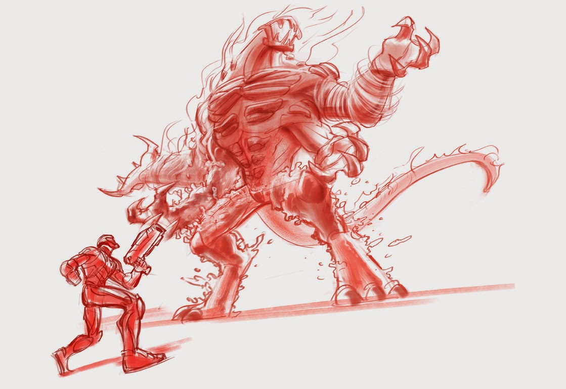
I developed a bunch of sketches for a promotional poster depicting Max Steel fighting Ultimate Elementor. While they ended up picking another artist's sketch, I'm still pretty happy with the way these came out. The greatest challenge was trying to depict Ultimate Elementor, who is several stories high, but keep Max from looking puny. There were the usual requirements of being super dynamic and forcing perspective.


Sooo ninja!
 I forgot that there was no cropping. Still a cool composition.
  Sigh. Max can't be running away or falling back.
This tricky thing with Ultimate Elementor is that all of his arms need to be doing something. They each represent a different elemental power, but even so, they can't all be throwing/slashing/shooting.


 I started doing these sketches in earthy reds and burnt sienna after working on a similar project with the fantastic story illustrator, Brocasso. Check out his work: http://www.brocasso.com
I'd seen him sketching up in these colors and when I asked him why not black or blue, he mentioned that sometimes that can look a little stark, but a warmer sketch color can look a little more appealing and  a little more like a traditional media. I found that a looser painting looks less smeary and more "painterly" when given this treatment. It was really ideal for a project which required a really fast turnaround. I think I only had a day or two to develop these.