Showing posts with label character design. Show all posts

Friday, August 15, 2014

The Anniversary - the Old Woman.

The Old Woman needed to embody empathy and often when I create characters who save others that are overwhelmed with some internal struggle, I find they can't just look kind and giving, they need to have a little hint of wisdom and experience. The wisdom and experience is what makes it seem like they can help solve "the problem, " and that is always in the eyes. There's got to be that inner strength.

My cartoony faces.

The photo liquify technique.


Wednesday, July 23, 2014

Pepe and Lucas - The Clown Car - A prop full of props.

As the action heated up in Pepe and Lucas, we introduced Pepe's clown car. Originally, the battle would have had a few more levels of escalation. Pepe would have begun battle with a mallet, then used a small canon, then a gigantic pie launching canon, followed by the clown car, then maybe transformed into a mech to do battle with the mech the mime would imagine. However, all that action would have added several minutes and would have really upset the pacing. After all, we originally intended to have something shorter in the 5 minute range and we still ended up with something in the 8 minute range. We pared down the action scenes but kept the climactic battle where the clown, as a last resort uses a clown car to challenge the mime. The mime, not to be outdone, mimes a robot mech, and they do battle. 

By the time the clown introduces the clown car, the weapons each character uses have progressed from the standard props associated with clowns and mimes to something that might fit right into a scifi movie. The clowns car was designed like the tiny car we're all familiar with , but it would have tons of Inspector Gadget arms holding various clown weapons so it would literally be "armed to the teeth." When I started designing it, the pie launcher was still a go, so I used another food weapon and introduced an egg firing gatling gun. To make it more ridiculous, I added a chicken to man the gun. We tried a range of cars to see what would look most natural in our evolving environment and story. I spent a fair amount of time trying ideas inspired by 40's, 50's and 60's European cars. I new it needed to have a touch of old world European nostalgia and by this time I was looking at a lot of vintage toys when designing for the clown. Looking at toys or models of an era is a great way to see how things have been simplified and stylized to their essence, but still maintain an element of fun. It was important to be inspired by reality, but not just to stylize reality, but to make it fit the alternative world we developed. I eventually settled on a VW Bug inspired look, but the element that finally clinched it for me was when I drew the bumper around the entire car. It looked just like a bumper car. A bumper car totally epitomized the rough banging around and jerky movements I imagined for Pepe's transportation.


I did a fair number of color variations for the car that would have matched Pepe's outfit, but it seemed to be better to have the car feel like a separate item with it's own color set. I kept the yellow from the scarf, but introduced the green compliment to really keep the focus on Pepe's head.

One of the few times I've had to design the underside of something.

Each element that popped out of the car needed an explanatory drawing.

It almost wasn't worth designing the balls, since that's a standard design and color set for actual juggling balls, but they were primary colors and it worked with Pepe's clothing colors. Since we were stylizing so much, and wear and tear and grunge were so much a part of the Pepe's identity, I paid special attention to the rust patches and dinks on the car as well as on the juggling balls. I wanted those touches to still retain a graphic quality to them, often so that they could look worn without losing some of the color vibrancy you might get from introducing smudges and dirt.

The chicken body didn't require much exploration, but I did take some time to work on the eyes and see if they should look more animal or more intelligent. Somewhere in there a Prussian helmet entered the fray.

Of course a clown car can fit buckets of other clowns in it, but in Pepe's situation, they're all robot clones of himself that work in unison to overpower the mime.

And that is how the task of designing one prop became a the task of developing several props. ;)

Sunday, July 20, 2014

Pepe and Lucas - A long road to find the right mime - Part 2

Since the chemistry between the clown and the mime was so important and they would take up the most screen time, I constantly compared them as I developed the mime character. For a while, I lined them up with both of the clown final designs to see if one resonated better than the other. The mime had a bit of a tom boy look in many of my designs as well as some of the other artists who tackled her. It was tricky to keep her sex a question. A lot of it came with hiding the hips somehow and exploring nose options. Eventually, a combination of some of the concepts led to the most sinewy and graceful character you see in the film, but a lot of exploration still went into the face even after it was clear we had the right body type.

As you can see, I created variations for the mouth, the nose, the eyes, and the eyebrows. If the clown was an explosive angry character, the mime needed to be a calm, graceful, centered character. Someone above it all. A consummate professional. The height difference made her seem a little more mature as well as making the clown seem a little more harmless.


The biggest twist in "Pepe and Lucas" is the reveal toward the end that the mime is actually a woman who hides her huge red clown hair underneath a hat, an element the clown finds irresistible. Different hairstyles seemed to work on different characters, but always the goal was to make the hair loud and colorful, something that would have to be hidden away in order for the audience to be able to focus on her performance. That visual connection created by that stop sign red color as well as the pure size adds to the sudden realization for the clown that he may have something in common with his antagonist after all.


It seemed insignificant when I started, but I played around with the number of painted on lashes. The one horizontal lash and one vertical tear below the eye were pretty traditional, but filling in that space with two extra lashes added just a touch more of femininity to the character to help strike that super delicate balance.
I still played around with the mouth too. Getting that one perfect pose and expression is so key to identifying the core of a character to the rest of the Brain Zoo team is painstaking. I usually only go about 1 to 3 iterations beyond that one sketch that feels right, but the mime was a much more hidden character. Even the smile was tricky. It needed to be confident and self-assured without being egotistical. It needed to be a little sly since she knows something we don't, but not smug. As you've seen the nose was a triangle wedge shape for a long time. I'd hoped to create a nose that was opposite to the clown's since the mime essentially represents an opposite, but the nose was so bold looking and what we needed was something smoother and graceful, so I ended up introducing a slight swoop to it.


Final mime design. Lucas.

Final mime design with hair exposed.

Once the mime was finally chosen, I sketched a few more mimes, since having really solidified what the mime represented for the film, a lot of my previous creations seemed unrelated and we didn't know at the time if we'd see other performers or if "Pepe and Lucas" would be a recurring short film project for us.

Pepe and Lucas - A long road to find the right mime - Part 1

The mime was the most challenging character to develop. It was established early on that she would be the clown's love interest, but it was important that her femininity be disguised to allow for an "ah hah" moment at the end. In terms of personality, if the clown was a bumbling slob, she would be a graceful intellectual. He would use very industrial technology for his gadgets and props. She would be able to create whatever was in the limits of her imagination, but always with a futuristic bent. Primitive past vs. Advanced Future. This early on, we hadn't established the world much or how much action/comedy/romance there would be. We wanted to establish a new style for our characters and a unique look for our mime.

 A more action contemporary take. Our "invisibility" effect for the objects she conjures ended up looking like glass or the Predator's invisibility cloak, but I still think a 2D dashed outline would have been fun too. At the outset of the project, I had in mind a much more slapstick kind of comedy/action, like a Bugs Bunny cartoon, and I ended up bringing in some of those classic elements - I gave the characters those iconic white gloves with 3 stripes on them. Originally, the Clown had a giant wooden mallet too. In early storyboards, I had the pupils of the eyes swap out for words and pictures of what they were thinking. The Clown also uses a white surrender flag at the climax of his battle with the Mime. I never got too classic cartoony with the Mime since I worked on her later in development, but there's s couple of Clown designs that definitely feel like they're right out of some early WB cartoons.


 When you're spitballing, it's not all gold.

 Art Deco motifs and stylings of that era were provided as a starting point for this project. Not much of that made it into the final designs, but it did generate some of the most unique designs for the Mime. I found that in order to have a mime still read as a mime, you can only adjust a few elements. The costume cannot be complex since all of the acting must be in the facial expressions. A really strong, simple silhouette is key to create solid, legible poses and you can see this simplicity applied to most real life mime costumes. Complex patterns tend to distract the eye from the movements. You'll see in later poses that I had to pull back on the patterns and weirder costume elements.


 I loved this one since it came out so unexpectedly weird. It's like a robot, toy mime splashed with an abstract painting.
 Ninja mime.
 The gentle giant.

An ice cream cone meets a bell hop.
None of these made it to the second round as sometimes happens, and lot more designs were to follow. These were just a little too out there. Stay tuned for the fine tuning of the mime character in the next post.

Friday, July 18, 2014

Pepe and Lucas - Making the Clown Part 2

In my last post, I said that the below sketch was the design that was really our first solid step forwards for our short film. 
However, we still made a few tweaks to the design. Pepe seemed weak and small, but he'd lost a little bit of his "clown-ness." I brought back in the bowler hat and flower. Eventually, we lost the cutoff gloves in favor of what I now think of as "Mickey Mouse" gloves. It just added that extra level of cartoony, which was becoming increasingly important as the story was becoming more and more ridiculous (in a good way).
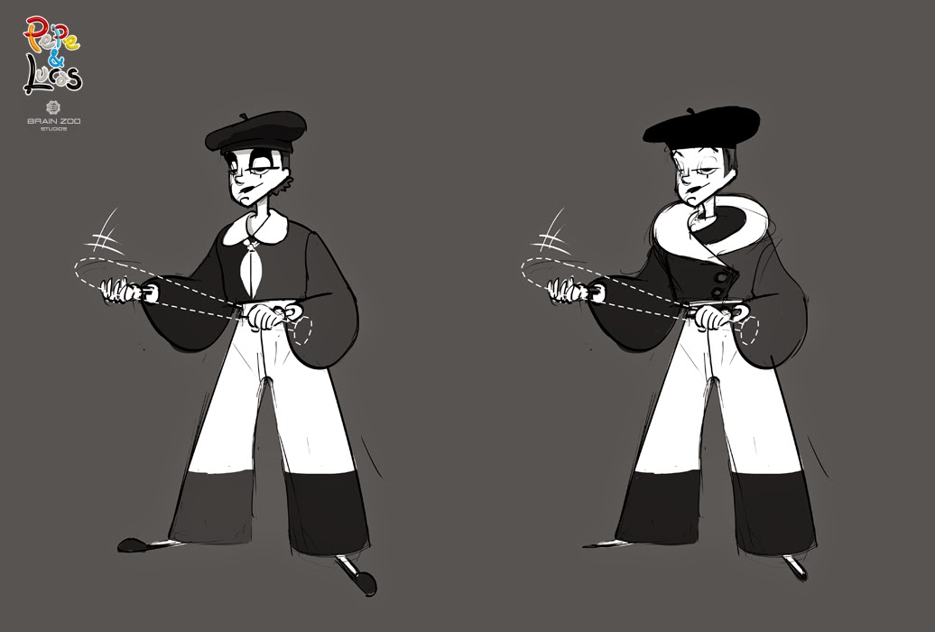
In my 1st round of sketches for any project, I don't always stick to a standard three quarters standing pose. It doesn't always describe the personality enough, plus it gets boring if you're doing several variations. However, I do end up doing some kind of standing pose eventually, so I can create a lineup to compare all my iterations and those of my artists in a lineup.

Before settling on the far right sketch, my director had me check out just how fat we could make our clown and still keep him appealing. Once we'd chosen a character with a scrawny neck, it became necessary to make his "fatness" match his natural physique from before his body went to crap -  a little pot belly became the solution.

Once I had an approved linework sketch, it was time to move on to color. I knew that I wanted red to be the dominant punch color, but I was less sure of the rest of the costume. It was kind of tricky, since clowns are so multi-colored, and mimes are made up entirely of black and white. No matter what color I picked, the clown would always dominate the screen over the mime.


For a little while, I worked with solid colors. I worked with variations of green compliments, but it didn't feel quite right.

Yellow, blue, and red. The primaries.

 Blue stripes and orange.

 Blue and white stripes and orange. I was testing out scarf colors too.

 I really wanted green to work...

By this time, I'd found that white stripes added a necessary level of complexity to the torso, but also broke up the power of whatever the shirt color was without adding a new color.


A clean and dirty version. We ended up going with the clean version since our beginning events were simplified to get the story moving, but also because excessive dirt and grime was distracting and dampened the colors a bit.


Eventually, I returned to primary colors. I think the reason that some of my earlier explorations didn't work was the addition of the secondary or tertiary colors. When I had worked with just primaries, the amount of each color was pretty even. I had thought that bringing in red to more than just the head would be too much and too monochromatic, but it felt just right, with blue being the second dominant color and a dash of yellow for the scarf. Easy right? In my next post, I'll upload the other clown option that we almost went with, but still kind of did.