Showing posts with label concept. Show all posts

Friday, August 15, 2014

The Anniversary - The Cemetery

Walking to the Cemetery

The main outdoor views included a pathway on a hill up to a cemetery, and the cemetery itself. It needed to work as both a stark scene as well as a beautiful scene. I kept the hill pretty open so that the vastness of it could inspire one with wonder or make someone feel totally alone. The other reason is that I knew we'd be revisiting the same locations several times over the course of the short and it would make showing different weather situations much easier with an expanse of sky clueing us in immediately.


The Cemetery

I liked all of the variations for the cemetery, but the two black and white ones didn't feel as grounded in the same world I had been developing as the third one. I had designed them to be more intimate, but that made them feel cozier, and not lonelier and more desolate. I took a cue from my hill design and kept the view pretty open with the color version I've posted. The other odd thing I found is that with the vast expanse, you get a feeling of how small the cemetery is whereas in the black and whites, you never see the perimeter of the property, so it looks like you're just seeing a small part. Obviously, the fence in the color version helped too. ;)


The Bernie Monster!

I recently completed a little style test for a horror project. The client was looking to find a way to stylize the look of their creature and make it more graphic, but also include the photo realism that a more contemporary audience is looking for. That's like two extreme opposites in styles right? But this is the same challenge that Sin City tackled. Our client was a big fan of Bernie Wrightson (blow mind away here), and as a proof of concept, I was tasked to create a photo real version of the below pen and ink, the results of which might be used to inform the visual style for the project's own creature.

I kept an overlay of the pen and ink for a long time before I modified them a little to make a more realistically lit character. It's anyone's guess as to what swampy materials were originally intended for the character, so I just did my best with lots of moss and roots. I tried to find a lot of things that would feel like body tissues and exposed nervous systems.


 Motion blur!

Friday, July 25, 2014

Pepe and Lucas - The Canon.


I followed much the same principles with the canon as I did with the pie launcher - primary colors, vintage toy inspiration, circus/carnival patterns, and some graphic wear and tear. The one caveat was that the canon needed to have a short enough barrel that Pepe could point it vertically to drop the mime's imagined dog in it.


Sunday, July 20, 2014

Pepe and Lucas - A long road to find the right mime - Part 2

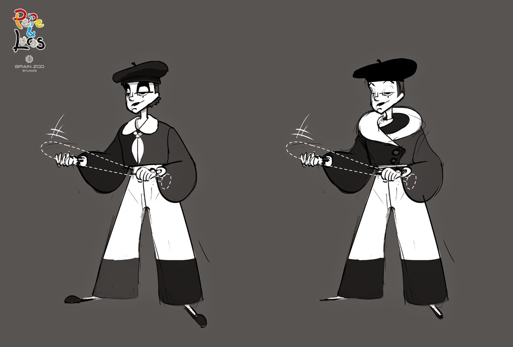
Since the chemistry between the clown and the mime was so important and they would take up the most screen time, I constantly compared them as I developed the mime character. For a while, I lined them up with both of the clown final designs to see if one resonated better than the other. The mime had a bit of a tom boy look in many of my designs as well as some of the other artists who tackled her. It was tricky to keep her sex a question. A lot of it came with hiding the hips somehow and exploring nose options. Eventually, a combination of some of the concepts led to the most sinewy and graceful character you see in the film, but a lot of exploration still went into the face even after it was clear we had the right body type.

As you can see, I created variations for the mouth, the nose, the eyes, and the eyebrows. If the clown was an explosive angry character, the mime needed to be a calm, graceful, centered character. Someone above it all. A consummate professional. The height difference made her seem a little more mature as well as making the clown seem a little more harmless.


The biggest twist in "Pepe and Lucas" is the reveal toward the end that the mime is actually a woman who hides her huge red clown hair underneath a hat, an element the clown finds irresistible. Different hairstyles seemed to work on different characters, but always the goal was to make the hair loud and colorful, something that would have to be hidden away in order for the audience to be able to focus on her performance. That visual connection created by that stop sign red color as well as the pure size adds to the sudden realization for the clown that he may have something in common with his antagonist after all.


It seemed insignificant when I started, but I played around with the number of painted on lashes. The one horizontal lash and one vertical tear below the eye were pretty traditional, but filling in that space with two extra lashes added just a touch more of femininity to the character to help strike that super delicate balance.
I still played around with the mouth too. Getting that one perfect pose and expression is so key to identifying the core of a character to the rest of the Brain Zoo team is painstaking. I usually only go about 1 to 3 iterations beyond that one sketch that feels right, but the mime was a much more hidden character. Even the smile was tricky. It needed to be confident and self-assured without being egotistical. It needed to be a little sly since she knows something we don't, but not smug. As you've seen the nose was a triangle wedge shape for a long time. I'd hoped to create a nose that was opposite to the clown's since the mime essentially represents an opposite, but the nose was so bold looking and what we needed was something smoother and graceful, so I ended up introducing a slight swoop to it.


Final mime design. Lucas.

Final mime design with hair exposed.

Once the mime was finally chosen, I sketched a few more mimes, since having really solidified what the mime represented for the film, a lot of my previous creations seemed unrelated and we didn't know at the time if we'd see other performers or if "Pepe and Lucas" would be a recurring short film project for us.

Pepe and Lucas - A long road to find the right mime - Part 1

The mime was the most challenging character to develop. It was established early on that she would be the clown's love interest, but it was important that her femininity be disguised to allow for an "ah hah" moment at the end. In terms of personality, if the clown was a bumbling slob, she would be a graceful intellectual. He would use very industrial technology for his gadgets and props. She would be able to create whatever was in the limits of her imagination, but always with a futuristic bent. Primitive past vs. Advanced Future. This early on, we hadn't established the world much or how much action/comedy/romance there would be. We wanted to establish a new style for our characters and a unique look for our mime.

 A more action contemporary take. Our "invisibility" effect for the objects she conjures ended up looking like glass or the Predator's invisibility cloak, but I still think a 2D dashed outline would have been fun too. At the outset of the project, I had in mind a much more slapstick kind of comedy/action, like a Bugs Bunny cartoon, and I ended up bringing in some of those classic elements - I gave the characters those iconic white gloves with 3 stripes on them. Originally, the Clown had a giant wooden mallet too. In early storyboards, I had the pupils of the eyes swap out for words and pictures of what they were thinking. The Clown also uses a white surrender flag at the climax of his battle with the Mime. I never got too classic cartoony with the Mime since I worked on her later in development, but there's s couple of Clown designs that definitely feel like they're right out of some early WB cartoons.


 When you're spitballing, it's not all gold.

 Art Deco motifs and stylings of that era were provided as a starting point for this project. Not much of that made it into the final designs, but it did generate some of the most unique designs for the Mime. I found that in order to have a mime still read as a mime, you can only adjust a few elements. The costume cannot be complex since all of the acting must be in the facial expressions. A really strong, simple silhouette is key to create solid, legible poses and you can see this simplicity applied to most real life mime costumes. Complex patterns tend to distract the eye from the movements. You'll see in later poses that I had to pull back on the patterns and weirder costume elements.


 I loved this one since it came out so unexpectedly weird. It's like a robot, toy mime splashed with an abstract painting.
 Ninja mime.
 The gentle giant.

An ice cream cone meets a bell hop.
None of these made it to the second round as sometimes happens, and lot more designs were to follow. These were just a little too out there. Stay tuned for the fine tuning of the mime character in the next post.

Wednesday, May 21, 2014

Gridsmasher's Finale!

Here's the last of the concepts I created for Gridsmasher - the Smash Stadium interior concepts. This was one of the last things I worked on for this project, and since it was a combination of many of the other concepts I was developing, the variations occurred mostly in color. However, you can see that Grizz's observation tower went through a design change and a scale change. Originally, the director wanted it to look like it could be an old school giant robot that might as some point in the show activate and do battle against evil forces. However, it started to become very focal and so we simplified it to the lowest black and white sketch and shrunk it down so it wasn't so imposing.


Once we had the basic structural designs in place, the primary focus became choosing the mood and color palette. We knew that the goal was to have a lot of pop colors to maintain excitement and energy to simulate the most awesome event ever. In my first pass, I kept the light and materials fairly monochromatic so that the holograms would really stand out as bright warm colors against a very dark background of deep blues, blacks, and purples. In shows like Tron Uprising and movies like Speed Racer, I saw a great deal of success in using black and white as neutrals against which a lot of colors can be displayed.


However, this was a little too serious and dramatic. We changed tack to depict space not as a dark void, but as this fun and brightly lit place, so that when you're at a game, it feels like you're outdoors at a sports game during the daytime. Games like Homeworld or Wildstar have really beautiful palettes where space looks like a just a vast sky of color. I tried a bunch of different color palettes and different space vistas.

 This ended up being the guide for our project. An epic afternoon in space.


 I was still hanging onto my darks here. ;)

 I wasn't interested in painting space as sky blue, but leave no stone unturned.

Maybe a little atmosphere...


Friday, June 14, 2013

Future Monopoly - Income Tax Building.


Whoa! Almost missed posting my favorite Future Monopoly design. I remember that this was one of the hardest designs to create. I mean really, what icon symbolizes Income Tax? The Income Tax Monopoly card symbol, a diamond within a diamond, didn't feel very powerful.


I tried some casino-esque varitions, and then some vault/fortress types with giant hands or pincers that would grab money, but nothing really looked well-considered. Still, we needed something oppressive, strong, and intimidating. I started with a box for the the building design since everything needed to fit within a rectangular perimeter. To make it oppressive, I tried to have the building literally look down on the player, so I just leaned a side out over the sidewalk and added a red eye sensor. The spire became an antenna and boom, the "big brother" evil machine overlord design was born!

Thursday, June 13, 2013

Nintendopoly - Broadway Corner to Corner.


Looking back at my first couple years working in entertainment, the corner to corner concepts were some of the most complex paintings I had to work on. They needed to remain clean, required a lot of perspective work, accurate figure to building scale, and needed to match a well-known and established style. As difficult as it was, I've always been a big fan of paintings where there's a lot of activity happening. Just looking at this, you can see how the Nintendopoly City would have been busy and bustling, with something new and crazy happening on every block. It's a shame this pitch didn't make it past the concept stage.

Nintendopoly - King Boo's Hotel, Donkey Kong Parking and More.


Trading Properties Menu.

Hotel.

Free Parking.


Waterworks.
Waterworks.

Chance.


 Electric Company.