Showing posts with label sketches. Show all posts

Monday, September 22, 2014

Adventure Time Fun!

Havin' some fun sketching Adventure Timey stuff.


Saturday, August 9, 2014

Tetris 3D Platformer Pitch - Sketch Phase

I now have the opportunity to share some ideas I generated for a proposal to make Tetris into a story based platform game for EA. Before the hardcore gamers get upset, we certainly meant to keep the core Tetris gameplay that has survived the ages, however, my team and I were tasked with developing a Tetris world where a character would go on some kind of adventure and along the way, play a lot of Tetris. Obviously, this sounds very vague, but I love these projects the most. This is when they're at the height of possibility.

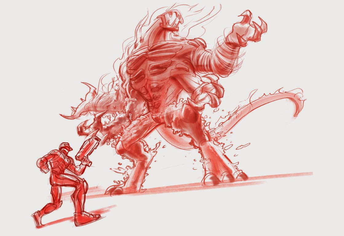
We started with a couple of key words - adventure, character, fun, environment, castle, epic. From there I began my ideation. We wanted to remain pretty obvious in our inclusion of tetrimino shapes in the landscape and like the nature of the original game, there was a lot of destruction and building. I originally started with a very Indiana Jones/Tomb Raider take of exploring these fantasy landscapes filled with castles and some cataclysmic disaster was causing the world to break apart (into tetriminos of course).


Usually in pitches, you want to deliver 3 different ideas, so if the first one was a standard treasure hunting/castle climbing adventure, then the next one had to be a little different. Since tetriminos are building blocks essentially, we were inspired to develop landscapes that were inspired by DNA strands,  molecules, and as you can see, crystalline structures.


It came up that the top crystal sketch didn't really have any visible tetriminos, so I incorporated them as veins inside the crystals that pulsed with energy.

For a while, I was just developing my concepts as environments that had tetrimino shapes in them that the player would travel through, so to start something new, I considered using them as a mode of transportation through the environments.


In our second phase, we developed our ideas with more of a fairytale  in mind and the EA team made a great suggestion to add a Russian influence to it. I've never been a huge fan, but I'm familiar with the game, but I'd totally forgotten that Tetris is a Russian game. Anyone remember these?


Our research into Russian art, architecture and folk lore led to a fresh new direction.

wide_
Russian minarets became a recurring shape in everything. In all of the following stages, we ended up incorporating some of the patterns and shapes we'd found in our research. Usually, I want the story elements to be absolutely perfect, but for once, we intentionally kept the story very vague. This helped us stay away from genre expectations and would allow the EA team to project whatever story they developed onto the designs we provided.

med_
Once I'd drawn trees with minaret buds on the top, the remaining concepts all displayed plant like elements.

I should mention that after our initial brainstorming session, we decided to deliver work in a template consisting of a landscape that was a wide shot, a medium shot, and a close shot of one style of environment. You'll notice that the first two concepts don't have much in the way of the classic tetrimino shapes. We discussed at length with EA all the possibilities that might exist for incorporating tetrimino shapes. What if they were like DNA strands and molecules, making up the entire game world, but not visible to the eye. What if playing triggered an event that sent you into a Tetris game. For example, what if you came to a door or wall that stood in your way, and you had the power to control the tetriminos, you could stack the wall/door tetriminos and collapse them, clearing your way. What if they acted as magical glyphs that acted as magical barriers that had to be destroyed to progress. As things were becoming more and more abstract, we tried to simplify our ideas even more so that exploration would just trigger some fantastical event that would take you into a Tetris game. In the concept below, the idea was that the minaret from the concept above would open up like a flower and emit a 3D column of tetriminos. Enter Tetris Game Challenge.

close_
As we developed more and more ideas, it allowed us to propose new ways of playing Tetris in 3 dimensions. The column of tetriminos could be rotating, or you could rotate the column so that the tetriminos that fell could be placed anywhere along the circumference of the cylinder.

Thursday, July 17, 2014

Pepe and Lucas - Making the Clown Part 1.

The first step we took to begin "Pepe and Lucas" was to develop the main characters - the mime, the magician, and the clown. We only had a brief description of the story events and the world and it essentially boiled down to 3 street performers with different abilities who compete/fight for money/fight for the audience's attention. It would take place in a stylized world made up of entertainers living in an entertainment-centric environment. None of the "races" of entertainers would get along and would have constant turf battles, like the Sharks and the Jets from "West Side Story". There'd be outrageous battles, fight scenes, chases, comedy, and a romantic angle. My director wanted something nostalgic calling back to the days of vaudeville and the art deco era. Basically, the western world in the 1920's through 1940's. Other than that, it was pretty much a blue sky situation, which was fantastic. 

Each character presented it's own unique challenge since the story was still in development, but the clown was perhaps the most challenging in that he would do the most changing and had to be the most appalling character at the beginning, but the most appealing by the end. We needed a character who was down-and-out, a slob, desperate for attention, and starving for success. He would be embittered by fading memories of success and essentially would have fallen in the world to the point of embodying the stereotype of an "angry drunk clown".


 A lot of my initial sketches featured the clown drinking or drunk and usually very fat and slovenly. It seemed impossible to empathize with this character and I realized that I had been working backwards. If you draw an unappealing character, you get an unappealing character. I started drawing the clown with both his angry/bitter face and also his revitalized hero face so I could make sure he worked on both sides of the personality spectrum.

 I also found very quickly, that while a fat slob version of the clown could be very pathetic, making him short and stocky or tall and heavy always made him look a little too dangerous or too thuggish. It would  look like someone who could really intimidate with their body weight, and that wouldn't demonstrate the kind of emotional or physical weakness we needed. I started drawing a lot of smaller, petite characters to offset that element. I realized that I needed someone small enough that they would not be a physical threat to anyone, someone aware of their size who would be much more prone to emotional outbursts. Essentially, a child with anger issues. Maintaining a small stature was important and to bring in physical weakness, I started reducing the size of the chins, making bigger heads and scrawnier necks.
 This guy made it to the final round, although he went through some revisions as you'll see.


 This is the sketch that eventually led to the final design. I didn't do a happy version of this because I knew I had it. It's the only drawing where I drew a sad clown. I had been so focused on the "angry" drunk stereotype, that I never considered drawing someone in despair.


 I was running out of steam here :)


Looking back on these designs, I remember that I explored both European clown costumes and history as well as American style clown costumes and history. Even though many elements of the clown costume don't change over time - big shoes, wig, face paint, baggy clothes, and of course the red nose, the clown more than any of the other characters felt right in a more American style, depression era costume. You'll see in a later post that I created full color clean and dirtied versions of the characters. I found that a clown with a more contemporary look or color palette or European dress didn't read as "broken" when dirtied up, just dirty. His patches were the patches of a clown costume, not the patches of a life hard fought. The hobo clown look of the American Depression said so clearly that this was as good as it got. It really represented his economic position in life. In the end that was sufficient and we didn't end up texturing him dirty for the short. It also seemed less like a costume and more like someone's day to day wardrobe. The nostalgia of that time also made the clown feel much more like a forgotten person who hadn't seen a good day in a long time, like he was permanently stuck in the gutters.

In my next post, I'll load up the color steps we took to bring Pepe to a full color finished character concept.

Friday, April 25, 2014

Max Steel vs Ultimate Elementor - SHOWDOWN!

I developed a bunch of sketches for a promotional poster depicting Max Steel fighting Ultimate Elementor. While they ended up picking another artist's sketch, I'm still pretty happy with the way these came out. The greatest challenge was trying to depict Ultimate Elementor, who is several stories high, but keep Max from looking puny. There were the usual requirements of being super dynamic and forcing perspective.


Sooo ninja!
 I forgot that there was no cropping. Still a cool composition.
  Sigh. Max can't be running away or falling back.
This tricky thing with Ultimate Elementor is that all of his arms need to be doing something. They each represent a different elemental power, but even so, they can't all be throwing/slashing/shooting.


 I started doing these sketches in earthy reds and burnt sienna after working on a similar project with the fantastic story illustrator, Brocasso. Check out his work: http://www.brocasso.com
I'd seen him sketching up in these colors and when I asked him why not black or blue, he mentioned that sometimes that can look a little stark, but a warmer sketch color can look a little more appealing and  a little more like a traditional media. I found that a looser painting looks less smeary and more "painterly" when given this treatment. It was really ideal for a project which required a really fast turnaround. I think I only had a day or two to develop these.

Thursday, January 2, 2014

The last of Inktober 2013.


While I'm not a compulsive sketcher, I do love to sketch and it was actually challenging to sketch something everyday for a month. Unfortunately, not everything comes out gold, so here are the last two good sketches of October. I did weed a few out and I'm not ashamed to say I redid a couple. Lesson learned: I've clearly crossed over to the digital side, cuz' man o man, I was begging for control Z. The ink was only flowing freely into accidents, but it's nice to know it can still come back and the daily sketching is a habit I've done the best I can to continue. I'll start posting those soon.

More Inktober 2013.