Friday, June 14, 2013

Monopoly World Cities Concepts

No, there are no littler people in Monopoly. This is a model village of a rural German town.

I loved my model village, but the above concept looked a little more gardeny and became the approved of design.
The last Monopoly project I worked on was Monopoly World Cities. The premise was that each color of the board was a small world version of a different world country.  Jack Sy and Alex Leon, who helped me on the Future Monopoly project as well, managed to handle most of the design work for this,  but I did get to tackle a few things. While the early steps of a property in the other games usually just consists of a sign post or garden, the early stages of the World Cities properties were supposed to be these mini parks. Instead of having a small focus in the middle, they needed to be modular and work as quarters. The Spain design is a little bit of an exception, but the idea was, that as soon as two quarters of the property were bought, it would change to the fountain. Any additional quarters of property that were bought would stay only display the bush arrangements.

Future Monopoly - Income Tax Building.


Whoa! Almost missed posting my favorite Future Monopoly design. I remember that this was one of the hardest designs to create. I mean really, what icon symbolizes Income Tax? The Income Tax Monopoly card symbol, a diamond within a diamond, didn't feel very powerful.


I tried some casino-esque varitions, and then some vault/fortress types with giant hands or pincers that would grab money, but nothing really looked well-considered. Still, we needed something oppressive, strong, and intimidating. I started with a box for the the building design since everything needed to fit within a rectangular perimeter. To make it oppressive, I tried to have the building literally look down on the player, so I just leaned a side out over the sidewalk and added a red eye sensor. The spire became an antenna and boom, the "big brother" evil machine overlord design was born!

Thursday, June 13, 2013

Nintendopoly - Broadway Corner to Corner.


Looking back at my first couple years working in entertainment, the corner to corner concepts were some of the most complex paintings I had to work on. They needed to remain clean, required a lot of perspective work, accurate figure to building scale, and needed to match a well-known and established style. As difficult as it was, I've always been a big fan of paintings where there's a lot of activity happening. Just looking at this, you can see how the Nintendopoly City would have been busy and bustling, with something new and crazy happening on every block. It's a shame this pitch didn't make it past the concept stage.

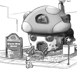
Nintendopoly - King Boo's Hotel, Donkey Kong Parking and More.


Trading Properties Menu.

Hotel.

Free Parking.


Waterworks.
Waterworks.

Chance.


 Electric Company.


Nintendopoly - From Empty Lot to Hotel continued....


1 Hotel.
4 Houses.
Lot for Rent
 Lot for Sale.

We ended up further developing the concepts from my last post. I especially enjoyed making the electronic store facade.

Saturday, June 8, 2013

Nintendopoly - From Empty Lot to Hotel.

 Upgraded to Hotel.
 Upgraded to House.
Empty Lot.

Nintendopoly - Pass GO!


Part of my Monopoly phase at BrainZoo, this was one of the first pieces I did to get the project going, to show how Nintendo could blend into the Monopoly world and give it a sense of adventure and achievement.

Additional Future Monopoly Designs.


After a lot is purchased it transforms into a public park. On the low value end, the properties have less and less foliage or holographic foliage and on the high end, there's grass and real trees and fountains. You can see that even early in the project, the terrarium idea of protecting the foliage from the elements makes an appearance.

Additional Future Monopoly Designs.

My "Free Parking" structure. It kind of reminds me of Johnny Rockets. This was loosely based on several parking lot toys I've seen. I often find when stylizing things for "family" based properties, it helps to look not only at real life references, but at really little kids' toys, where they start to abstract down to only the most basic shapes. It makes making the jump to other styles an easier transition, while maintaining it's parking loty essence.


 Above are a series of empty lot "for sale" signs. Building on the idea of multiple levels and structures expanding and building themselves up level by level, we left the the surface as a translucent circuit board so you can see that there's a shaft below it the house/hotel might grow out of. I especially notice this now looking at the lot signs and trains, but aside from being more "family" friendly, we were really limited by time and budget and so we had to keep the shapes of our designs very simple. However, we ended up really putting a lot of time into the interior designs and textures, breaking things up with lifework, pattern, and color shifts. Our overall style owes a lot to these automatic constraints.
Future train designs.