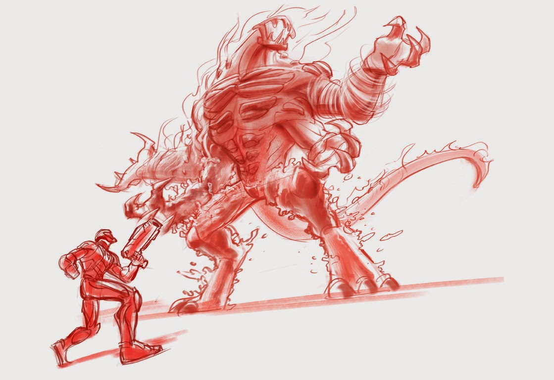
I developed a bunch of sketches for a promotional poster depicting Max Steel fighting Ultimate Elementor. While they ended up picking another artist's sketch, I'm still pretty happy with the way these came out. The greatest challenge was trying to depict Ultimate Elementor, who is several stories high, but keep Max from looking puny. There were the usual requirements of being super dynamic and forcing perspective.
Sooo ninja!
I forgot that there was no cropping. Still a cool composition.
Sigh. Max can't be running away or falling back.
This tricky thing with Ultimate Elementor is that all of his arms need to be doing something. They each represent a different elemental power, but even so, they can't all be throwing/slashing/shooting.
I started doing these sketches in earthy reds and burnt sienna after working on a similar project with the fantastic story illustrator, Brocasso. Check out his work: http://www.brocasso.com
I'd seen him sketching up in these colors and when I asked him why not black or blue, he mentioned that sometimes that can look a little stark, but a warmer sketch color can look a little more appealing and a little more like a traditional media. I found that a looser painting looks less smeary and more "painterly" when given this treatment. It was really ideal for a project which required a really fast turnaround. I think I only had a day or two to develop these.


No comments:
Post a Comment