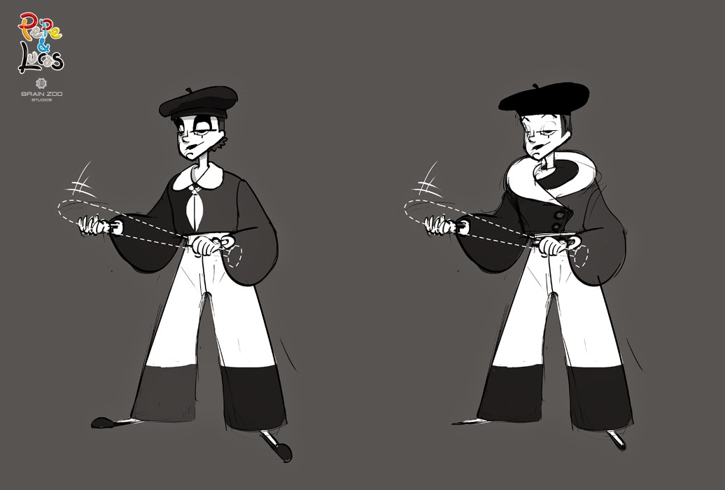
The mime was the most challenging character to develop. It was established early on that she would be the clown's love interest, but it was important that her femininity be disguised to allow for an "ah hah" moment at the end. In terms of personality, if the clown was a bumbling slob, she would be a graceful intellectual. He would use very industrial technology for his gadgets and props. She would be able to create whatever was in the limits of her imagination, but always with a futuristic bent. Primitive past vs. Advanced Future. This early on, we hadn't established the world much or how much action/comedy/romance there would be. We wanted to establish a new style for our characters and a unique look for our mime.
When you're spitballing, it's not all gold.
Art Deco motifs and stylings of that era were provided as a starting point for this project. Not much of that made it into the final designs, but it did generate some of the most unique designs for the Mime. I found that in order to have a mime still read as a mime, you can only adjust a few elements. The costume cannot be complex since all of the acting must be in the facial expressions. A really strong, simple silhouette is key to create solid, legible poses and you can see this simplicity applied to most real life mime costumes. Complex patterns tend to distract the eye from the movements. You'll see in later poses that I had to pull back on the patterns and weirder costume elements.
I loved this one since it came out so unexpectedly weird. It's like a robot, toy mime splashed with an abstract painting.
Ninja mime.
The gentle giant.
An ice cream cone meets a bell hop.
None of these made it to the second round as sometimes happens, and lot more designs were to follow. These were just a little too out there. Stay tuned for the fine tuning of the mime character in the next post.


No comments:
Post a Comment